Apple's MacBook Pro Touch Bar is gone. Good riddance
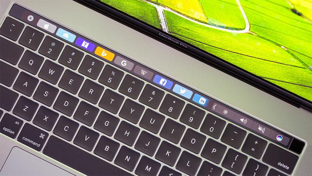
When Apple debuted the Touch Bar on its new MacBook Pro laptops five years ago, I was willing to give the technology giant the benefit of the doubt. The narrow touch-sensitive display along the top of the keyboard certainly offered a surprising new user interface option. And I needed a new computer. It was a chance to try something new.
Alas, after months of daily use, I concluded that for me, the Touch Bar is far worse than the function keys it replaced. It's an overengineered doodad that caused problems I never had with keyboards, and it offered features I never used.
When Apple announced it, then-design leader Jony Ive told CNET the Touch Bar is "the beginning of a very interesting direction." Now it's the merciful end.
So yes, I'm delighted that Apple ditched the Touch Bar in the new MacBook Pro 16-inch and 14-inch laptops with upgraded Apple silicon, which it announced at an October product event where it also unveiled the AirPods 3 and new HomePod Mini colors.
Read more: How to buy Apple's new MacBook, but it may cost you a lot
What I hate about the Touch Bar
I'm a touch typist but, despite its name, you can't navigate the Touch Bar by touch. Controlling screen brightness and speaker volume is far slower with the Touch Bar than a conventional keyboard, requiring me to look down so I can jab the correct spot.
Apple promised the Touch Bar would unleash creativity with visual controls for DJs, a cornucopia of emoji choices and adaptive command menus for Photoshop. None of that came true for me.
I applaud Apple for experimenting, and not everyone shares my dislike. My colleague Dan Ackerman isn't a big fan, but prefers the Touch Bar controls for controlling volume and brightness.

Still, not everything new is better. Even ardent fans would be dispirited to learn how much the Touch Bar shortens battery life and increases the MacBook Pro's already considerable cost.
Especially in its early years, the Touch Bar was prone to false positives. When typing numbers into a web form, my fingertips sometimes overshot and brushed against some Touch Bar button to launch some disastrous process like reloading the page. To its credit, Apple updates eased these problems. Still, I find it harder than ever to get the volume and brightness controls to respond quickly on the latest Macs.
The only bright spot for me is occasionally scrubbing through video. The Touch Bar handles this function just fine, though it's hardly revolutionary.
Turns out that escape key is useful
Another widespread Touch Bar complaint, particularly among programmers, was the sacrifice of a physical escape key for the first three years of the Touch Bar's existence. The company fixed that problem with its 2019-era MacBook Pro models, which also ejected the despised "butterfly" keyboard. (It's clear Apple was listening to feedback, a pleasant surprise for a company that can be imperious.)
See also
Newer MacBooks also benefit from the fingerprint reader that debuted on the Touch Bar's right edge. That's great for logging into your Mac, but it was only a cosmetic part of the Touch Bar.
The Touch Bar might have benefited from haptic feedback like the simulated clicks of Apple's unsurpassed trackpads. In the long run, it could perhaps even have adopted technology to add texture to touchscreens so you could find keys by feel. I have a hard time imagining any of that would be better than a plain old mechanical keyboard.
The Touch Bar's lost potential
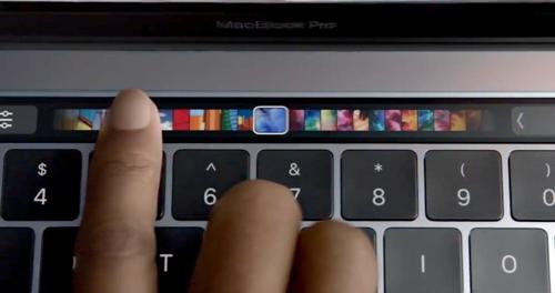
The Touch Bar's most exciting potential in my view was feature discovery, a way to reveal abilities ordinarily hidden in an app's user interface. In principle, it could make actions more convenient or teach me something I didn't even know was possible. Apple Photos, for example, shows thumbnails that give a preview of filter effects applied to your pictures.
In practice, that just didn't work for me. Call me old-fashioned, but keyboards are for typing and screens are for displaying information.
In contrast, I use the touchscreens on Windows laptops and Chromebooks all the time to position my cursor, check checkboxes and scroll through documents. It's natural enough that afterward, I find myself tapping and swiping my MacBook screens. Apple has publicly pooh-poohed the idea of touchscreen Macs for years.
Weak software support also undermined the Touch Bar's potential. Macs already are a small part of the laptop market, and Touch Bar-equipped MacBook Pros are an even smaller part. There simply isn't much incentive for developers to invest in supporting it. Adobe cooperated with Apple to build Touch Bar abilities into Photoshop in time for the MacBook Pro's launch, but never bothered with Adobe Lightroom, the photo editing tool that I use most of the time.
Vision isn't everything
Apple co-founder Steve Jobs famously disliked focus groups, believing consumers lacked the vision to know what they really wanted.
There's some truth to that. Apple's vision served us well with the Macintosh, iPod and iPhone. Too bad the Touch Bar vision didn't win out over the more disappointing reality.
Apple's new MacBook Pro models come in 14-inch and 16-inch size options, and also feature more ports, MagSafe charging, upgraded cameras and... a notched display like the iPhone.
Comments Apple Event LaptopsNotification on Notification off Apple}})