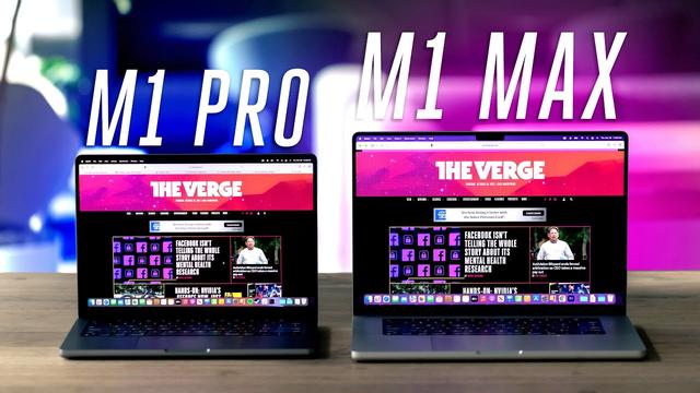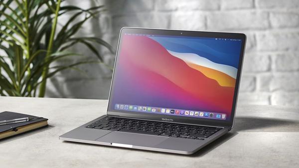
Hands-on: The new 14-inch MacBook Pro is a stunning return to form Guides
The new 14-inch and 16-inch MacBook Pro models have officially arrived. I paid a visit to my local Apple Store this morning to pick up a 14-inch model, plus a few Apple Polishing Cloths (don’t ask me why). Head below for some quick first impressions after unboxing Apple’s latest and greatest MacBook Pro, which is a return to form in many ways.
My configuration
While I have used (and greatly enjoyed) the 16-inch MacBook Pro form factor released in 2019, I downsized this year to the new 14-inch model in silver. The 16-inch MacBook Pro form factor can get unwieldy pretty quickly, so this year I opted for the 14-inch, which should be far more manageable for things like travel.
Here are the specs of the machine I purchased:
If I were doing it over again, I would probably have opted for 32GB of RAM rather than the 1TB of SSD storage (which is a bit overkill for my needs). Nonetheless, this is the configuration I was able to get for day one pick up, and I’m pretty happy with it.
What notch?
I didn’t believe the notch rumors, so I was amazed when they turned out to be true and slightly disappointed at the notion of having a notch without the added benefit of Face ID. After a few hours with the new 14-inch MacBook Pro, I still wish Apple would bring Face ID to the Mac, but I’m not bothered by the notch at all.
The notch on the new MacBook Pro exists almost entirely inside the macOS menu bar that has been a staple for years. The way it works is that you have a 16:10 display below the notch and menu bar area. So one way to look at things is that the menu bar and notch area is pure bonus screen real estate.
Ports (and MagSafe) are back
The new MacBook Pro features three Thunderbolt ports, an HDMI port, an SD card slot, and MagSafe for charging. Feels a lot like 2015, right?
I will almost certainly never use the SD card slot on the side of my new MacBook Pro. I may use the HDMI port from time to time, such as for connecting to a TV in a hotel room. But MagSafe? I’m thrilled to have MagSafe back on the Mac. Plus, I’m very happy to have the added versatility of being able to charge with either MagSafe or a USB-C port.
Just a note if you’re struggling to choose between silver and space gray: the MagSafe connector is not color-matched to your machine. Instead, you’ll get a silver MagSafe connector regardless of whether you choose the silver or space gray MacBook Pro color. Having a color-matched MagSafe connector was enough to push me towards buying a silver MacBook Pro.
Display
The display on the new MacBooks is simply stunning. The combination of the higher resolution display, the mini-LED backlighting, and the ProMotion refresh rate makes for the single biggest year-over-year jump in MacBook Pro display quality that I can remember.
One of the reasons I opted for the 14-inch model instead of the 16-inch is because of this higher-resolution display. The 14-inch MacBook Pro has a resolution of 3,024 by 1,964 pixels. This makes for 254 pixels per inch, which means the new MacBook Pro ships at a native 2x Retina resolution by default.
With most of my previous MacBook Pro models, I opted for the “More Space” display resolution option in System Preferences. With the 14-inch MacBook Pro, I’ll be sticking with the default. It’s just so good. The 14-inch display really does feel like the “sweet spot” between 13-inches and 16-inches, particular in this compact and edge-to-edge form factor.
The combination of the ProMotion display and M1 Pro processor means that the performance of the MacBook Pro is smooth in every way imaginable. The ProMotion display means that animations, scrolling through webpages, and more are incredibly fluid – just like on the iPad Pro and iPhone 13 Pro. One thing to note, however, is that there’s still some work to be done on the software side of things, as Apple and third-party developers both continue to update their apps to take advantage of the higher refresh rate tech.
The new aspect ratio will also take some time to be accommodated for by third-party apps.
Design
Finally, in terms of design, the new MacBook Pro models do something that Apple hasn’t done in years: they prioritize function over form. That’s not to say the new machines aren’t impressive from a design standpoint, but rather they do a much better job at striking the balance between design and functionality.
The new 14-inch MacBook Pro is the same thickness as the 13-inch M1 MacBook Pro released last year, but it certainly looks thicker. This is due to the flatter design around the edges, a change that Apple has said allows it to fit more internally. It is also noticeably heavier, at 3.5 pounds (1.6kg) versus 3.0 pounds (1.4kg).
Other design tidbits:
Wrap up
That’s all for now. I’ll have more thoughts on the new 14-inch MacBook Pro over the coming days and weeks, but I just had to get these initial impressions out of my system. Have any questions for me? Let me know down in the comments!

FTC: We use income earning auto affiliate links. More.
Check out 9to5Mac on YouTube for more Apple news:
}})